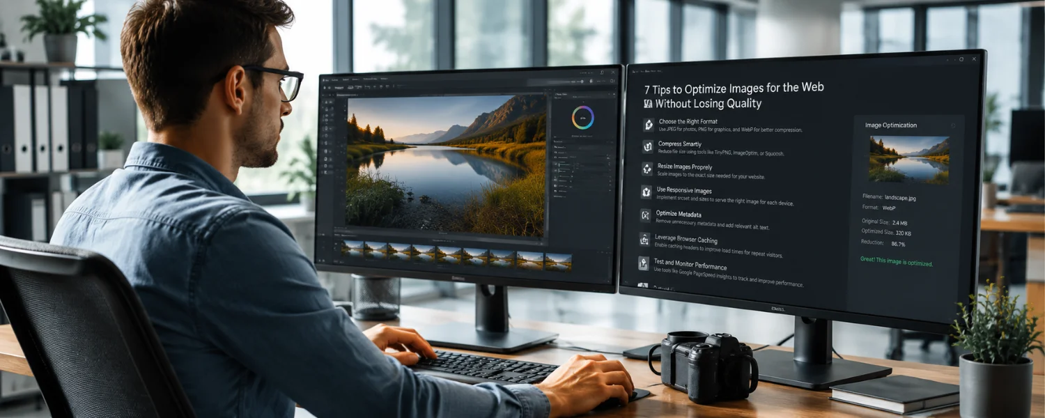
Optimize Images Without Losing Quality: The Complete, Up-to-Date Guide
Key Takeaways
- Use the right format for the job—JPEG/WebP/AVIF for photos, PNG/SVG for graphics—to shrink file size without sacrificing clarity.
- Resize to the largest display size you actually need, then compress with sensible quality settings and strip unneeded metadata.
- Serve responsive images with srcset and sizes, set width/height or aspect-ratio to prevent layout shift, and lazy-load non-critical media.
- Automate optimization in your CMS or build pipeline and consider a CDN-based image service for real-time format conversion and resizing.
- Measure real impact using Core Web Vitals (LCP, CLS) with Lighthouse or WebPageTest, then iterate to protect both UX and SEO.
Images are the first thing many visitors notice—and the heaviest assets most pages carry. The art is in keeping visuals sharp while pages feel instant. Done right, image optimization preserves quality, slashes bytes, and strengthens your Core Web Vitals so more families, readers, and customers actually see your content instead of bouncing on a slow load.
Understanding Image Compression
Image optimization means reducing file size without visibly degrading quality. You can do this at creation time using “Export” options in tools like Photoshop or GIMP, or directly on your site using techniques such as lazy loading and responsive delivery. The goal is simple: minimize what users download so pages load fast while images stay crisp.
There are two main compression approaches:
- Lossless: Reduces size without altering pixels (great for graphics, UI, and when exact fidelity matters). PNG and some WebP/AVIF settings can be lossless.
- Lossy: Removes detail the eye is unlikely to notice (ideal for most photos). JPEG, WebP, and AVIF shine here when tuned well.
Well-optimized images improve satisfaction, engagement, and SEO. Faster loads lift conversions and help your Largest Contentful Paint (LCP) score—an essential Core Web Vital.
Image Formats and Their Characteristics
- JPEG (photos, lossy) JPEG is ubiquitous for photographs because it balances quality and size. Use moderate compression (often quality 60–75) to avoid pixelation or banding. Progressive JPEGs can improve perceived loading.
- PNG (graphics, lossless + alpha) PNG preserves exact pixels and supports transparency. Use PNG-8 for simple graphics with limited colors (logos, icons) and PNG-24 for complex transparency. Avoid PNG for large photos; convert those to JPEG/WebP/AVIF.
- GIF (limited color, simple animation) GIF supports 256 colors and basic animation, making it poor for full-color photos. For motion, replace animated GIFs with MP4/WebM video or animated WebP for smaller, smoother results.
- TIFF (archival/print) TIFF offers both lossy and lossless modes and preserves high fidelity for print or storage—but file sizes are large. Convert TIFF to web formats before publishing.
- WebP (modern, lossy/lossless + alpha) WebP typically yields 25–35% smaller files than JPEG at comparable quality and supports transparency. Browser support is strong across modern browsers. Target quality around 60–80 for photos.
- AVIF (next‑gen, very high compression efficiency) AVIF often beats WebP and JPEG by 30–50% at similar perceived quality and supports HDR and alpha. Support is now broad in modern browsers. Quality settings around 30–55 often work well.
- SVG (vector graphics) SVG is ideal for logos, icons, and simple illustrations. It is resolution‑independent and tiny when optimized. Always sanitize and minify SVGs.
- Compressing Images Before Uploading Resizing assets to their intended display size before uploading is the biggest win. A 4000 px DSLR photo displayed at 800 px wastes bandwidth and storage. Preprocess with Photoshop, GIMP, Preview (Mac), Paint (Windows), Canva, Squoosh.app, or ImageOptim to resize, compress, and strip metadata.
- Match the largest size a given image will be displayed (e.g., hero image vs. thumbnail).
- Convert photos to WebP or AVIF when possible; keep a JPEG fallback if needed.
- Set sensible quality: JPEG/WebP 60–75; AVIF 30–55; PNG-8 for flat graphics.
- Convert color profile to sRGB and strip unnecessary EXIF/ICC metadata.
- Adobe Photoshop Photoshop remains a trusted option for quality control. Use File > Export > Export As (or Save for Web) to compare formats and quality in a live preview. It handles JPEG for photos and PNG-8/24 for graphics, and you can batch export various sizes. You can also export WebP with current versions or a plugin.
- GIMP GIMP is a free, cross‑platform editor for Linux, Windows, and macOS. It offers precise control over scaling, sharpening, and export parameters. You can preview resulting file size and quality and use plugins for WebP/AVIF.
- Kraken.io Kraken.io provides bulk optimization via web app, API, and a WordPress plugin. It can losslessly or lossily compress existing libraries and supports auto‑resizing and WebP conversion. This is efficient when you need to optimize many images at once.
- TinyPNG/TinyJPG TinyPNG (for PNG) and TinyJPG (for JPEG) are simple, free‑to‑start tools that compress multiple images at once in your browser or via a plugin/API. They're great for quick wins when you don't need advanced editing.
- Imagify Imagify's WordPress plugin balances quality and size, integrates smoothly with WooCommerce and NextGEN Gallery, and can convert images to WebP. As with any plugin, review how it uses server resources; consider offloading heavy processing via API or CDN when possible.
- More excellent options
- ImageOptim (macOS), Caesium (Windows), and Squoosh.app (web) for quick local compression.
- ShortPixel, EWWW Image Optimizer, and Smush for WordPress automation.
- Build tools: imagemin, Sharp/libvips, cwebp/avifenc for CI/CD pipelines.
- CDN services: Cloudflare Images/Polish, Cloudinary, Imgix, Akamai Image Manager for real‑time format conversion and resizing.
Compressing Pre‑Uploaded Images
If your site already has unoptimized images, you can still fix them without hurting quality:
- Scan pages with Google PageSpeed Insights or Lighthouse to find heavy images.
- Use WordPress plugins like EWWW Image Optimizer, ShortPixel, Smush, or Imagify to bulk‑optimize the Media Library and convert to WebP.
- With a CDN image service, enable “auto quality,” “auto format,” and set breakpoints once—assets are then optimized on the fly.
- For static sites, run a one‑time optimization pass using imagemin/Sharp, then redeploy.
Importance of Image Compression
Faster images support better responsiveness, higher engagement, and stronger SEO. They directly influence Core Web Vitals:
- LCP: Your hero image often is the LCP element—optimize and prioritize it.
- CLS: Reserve space by setting width and height (or aspect-ratio) to prevent layout shifts.
- INP/TBT: Lighter pages reduce main‑thread work and network contention.
Compressing images isn't only about speed; it saves storage and bandwidth and improves reliability on slow mobile connections.
Using the Correct Image Dimensions
Right-sizing images matters as much as compression. Large images slow pages; overly small images look blurry. Use dimensions that match your design and breakpoints—there's no universal “square” recommendation. Square images are fine if your layout calls for them, but most designs benefit from aspect ratios aligned to their containers (e.g., 16:9 hero, 4:3 cards, 1:1 avatars).
- Determine the maximum rendered size for each placement (desktop, tablet, mobile).
- Export multiple sizes and provide them with srcset and sizes.
- For high‑DPR screens, ensure srcset includes 2x options or use sizes that supply enough pixels.
- Never upscale in the browser—always provide source images at or above the target display size.
What Is the Benefit of Compressing Images?
Properly compressed, right‑sized images create faster, more resilient pages that increase time on site, conversion, and search visibility. They reduce loading times and prevent lag, keeping visitors engaged. Pair compression with correct dimensions for the best results—quality stays intact, and performance improves.
Responsive Delivery: Code Patterns That Work
Use srcset and sizes for flexible layouts
Provide multiple widths so the browser picks the best one:
Example pattern (simplified):
Serve modern formats with fallback
Use AVIF/WebP when supported, fall back to JPEG/PNG when not:
Prioritize your hero image
- Add fetchpriority=”high” on the LCP image.
- Place it early in the HTML and avoid lazy-loading it.
- Preload it only when you're confident it is consistently the LCP element.
Prevent layout shift
- Always set width and height attributes or use CSS aspect-ratio to reserve space.
- Ensure captions and overlays also have reserved space.
- Lazy‑load offscreen images Use loading=”lazy” for noncritical images and decoding=”async” to avoid blocking the main thread. Consider a blurred or color‑dominant placeholder for smoother perception.
- Practical Settings That Protect Quality
- JPEG/WebP quality: start at 60–75; increase only if artifacts are noticeable.
- AVIF quality: 30–55 often delivers excellent results at tiny sizes.
- PNG: prefer PNG-8 for flat graphics with limited colors; keep transparency only when needed.
- Chroma subsampling: 4:2:0 is fine for photos; use 4:4:4 for text-on-image or UI if needed.
- Sharpen slightly after downscaling to maintain perceived detail.
- Strip metadata unless you need copyright, orientation, or alt/title preserved within DAM workflows.
- Use sRGB to avoid unexpected color shifts in browsers.
WordPress: Fast Wins and Safe Defaults
- Set maximum image dimensions in Media settings; avoid uploading originals larger than you'll display.
- Use a reputable optimizer plugin (ShortPixel, Imagify, EWWW, Smush) with WebP/AVIF conversion enabled.
- Regenerate thumbnails after changing sizes or theme breakpoints.
- Enable native lazy loading and ensure width/height attributes are present (Gutenberg adds these by default).
- Consider a CDN image service for auto‑format, auto‑quality, and on‑the‑fly resizing.
Accessibility and SEO for Images
- Write meaningful alt text that conveys purpose, not just keywords; leave alt empty for decorative images.
- Use descriptive, hyphenated filenames (family-summer-camp-photos.jpg).
- Add captions where they add context; use figure/figcaption semantically.
- Include images in your XML sitemap and structured data (ImageObject, Organization logo) where relevant.
- Provide Open Graph (og:image) and Twitter Card images sized for social sharing.
Testing and Monitoring
- Run Lighthouse/PageSpeed Insights on key templates (home, article, product) to identify image opportunities.
- Use WebPageTest to validate LCP image priority and check waterfalls.
- In Chrome DevTools, inspect the Network panel to confirm formats, sizes, caching, and compression.
- Track Core Web Vitals in Search Console and iterate based on field data.
Common Mistakes to Avoid
- Uploading print‑sized TIFF/PNG photos instead of web‑ready WebP/AVIF/JPEG.
- Relying on CSS/HTML to downscale huge originals; resize first, then compress.
- Lazy‑loading the LCP image or omitting width/height and causing CLS.
- Over‑compressing brand marks and UI (use SVG/PNG-8 to keep edges crisp).
- Using animated GIFs for long animations—use MP4/WebM or animated WebP.
Quick Implementation Checklist
- Decide per-placement max widths and aspect ratios.
- Batch resize originals to those widths, export AVIF/WebP (plus JPEG/PNG fallback).
- Set JPEG/WebP Q 60–75, AVIF 30–55; convert to sRGB and strip metadata.
- Integrate srcset/sizes, width/height, loading=”lazy”, decoding=”async”.
- Prioritize the LCP image with fetchpriority=”high”.
- Automate ongoing optimization via plugin, build tools, or a CDN image service.
- Measure with Lighthouse/WebPageTest; watch Core Web Vitals and refine.
Edited and Enhanced Original Guidance
Understanding image compression (refined)
Using images to convey ideas is highly effective for web pages, websites, and social media. People respond more positively to pictures than long descriptions, so high‑quality images are essential to attract and engage users. However, images also impact loading time, which affects viewership. Image compression and optimization reduce file size without visible quality loss—either during creation (Export settings in Photoshop/GIMP) or on your website (e.g., lazy loading, responsive images). The aim is to minimize data downloads for faster loads while maintaining clarity and sharpness, improving user satisfaction and search visibility.
- Image formats and their characteristics (expanded) JPEG is widely used for photos because it compresses efficiently with minimal visible degradation, but avoid over‑compression to prevent artifacts. GIF supports lossy/lossless modes but is limited to 256 colors; use it sparingly and prefer video or animated WebP for animation. TIFF preserves high quality for storage/print but is too large for the web. PNG uses lossless compression and supports transparency, perfect for logos and UI. Modern formats like WebP and AVIF typically produce much smaller files at the same quality; SVG is best for scalable graphics.
- Compressing images before uploading (clarified) Resize images to their intended display size first. For example, if your WordPress theme displays a blog image at 500×500, uploading a 1024×1024 or 4000×4000 version only increases file size and slows your site. Use Photoshop, Preview, Paint, Canva, GIMP, or Squoosh to crop/resize and export the right format. This quick step boosts performance and saves disk space.
- Adobe Photoshop (edited) Photoshop preserves image quality while reducing file size via Export As/Save for Web. It handles JPEG, PNG-8/24, and WebP with granular control over color, resolution, and compression. Preview results and file sizes before saving to find the best balance.
- GIMP (edited) GIMP is free, open‑source, and runs on Linux, Windows, and macOS. It allows precise compression control and shows estimated file size during export. Plugins extend support to WebP and AVIF for modern delivery.
- Kraken.io (corrected) Kraken.io's web app, API, and WordPress plugin optimize current and past uploads automatically, removing the need for manual edits and improving site performance with minimal effort.
- TinyPNG (clarified) TinyPNG/TinyJPG provide quick, user‑friendly compression for multiple files at once and offer plugins for CMS workflows. They're excellent for fast optimization without complex setup.
- Imagify (edited) Imagify balances quality and size and integrates with WooCommerce and NextGEN Gallery. Review how any plugin processes images and consider options that reduce server load (API/CDN) for smoother performance.
- Compressing pre‑uploaded images (reinforced) If you already uploaded images without compression, you can still improve them. Tools like Google PageSpeed Insights and WordPress plugins such as EWWW Image Optimizer can help with bulk optimization and conversion to modern formats.
Importance of image compression (refined)
Compression makes your site responsive and fast. Quick‑loading pages draw more visitors; slow pages deter them. Optimized images support better SEO and user retention.
- Using the correct image dimensions (corrected) Beyond compression, correct dimensions are crucial. Large images slow pages; small ones look poor. Match dimensions to your design's required sizes and aspect ratios; use square images only when the layout calls for them. Responsive images keep quality consistent across devices.
- Benefits of compressing images (refined) Compression reduces load times, prevents lag, and improves responsiveness—positively impacting traffic and engagement. Pair with correct dimensions and responsive delivery for the best results across your site, from hero images to thumbnails.